Resource Furniture
Curating the best in transforming furniture technology, Resource is at the forefront of urban living solutions and design. After nearly two decades of leadership in the industry, Resource sought to refresh its brand—updated identity, website, and communications to reflect a legacy of quality, beauty, and lifestyle ingenuity.
Brand Strategy
Identity Design
Brand Collateral
Website Design
Website Development
Getting clear on public perception, internal priorities, and the area of opportunity
Brand research initiatives included an internal workshop, stakeholder interviews, quantitative and qualitative data gathering, competitive analyses, and market research activities. We sought to understand the needs of each of Resource’s core markets: empty nesters, young families, and architects & interior designers. From this research deep dive, we shifted to strategy gear.
Distilling 17 years of business into a bold new direction
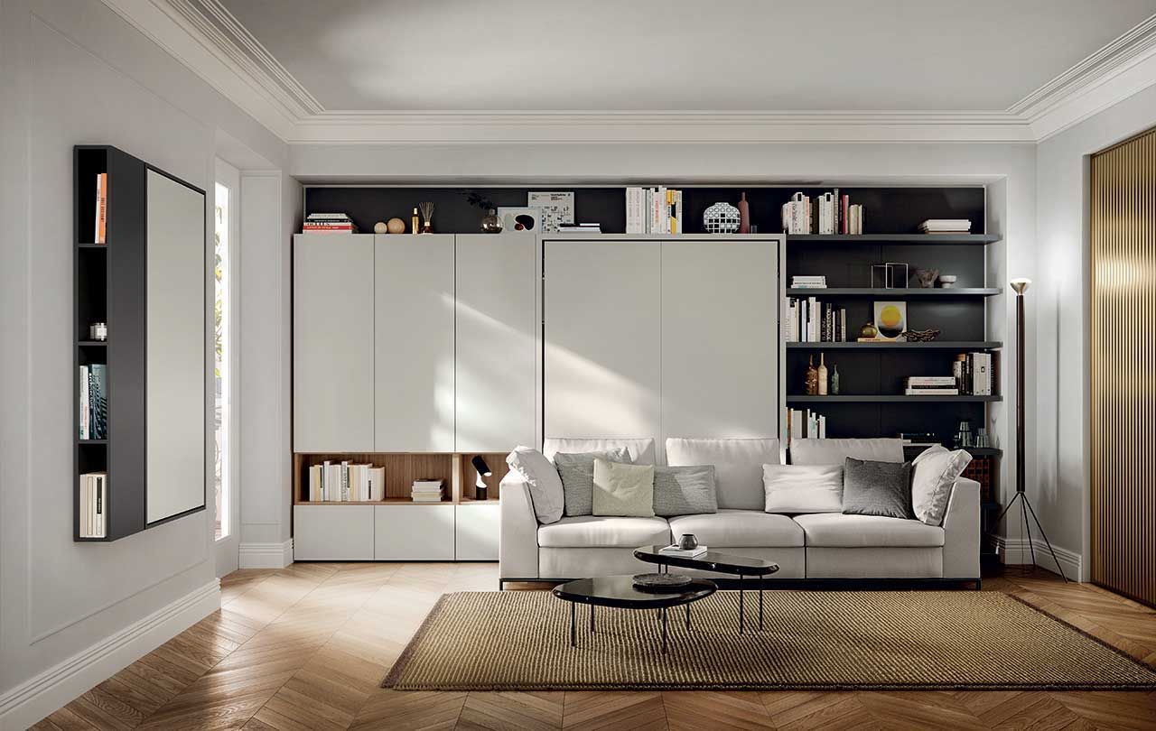
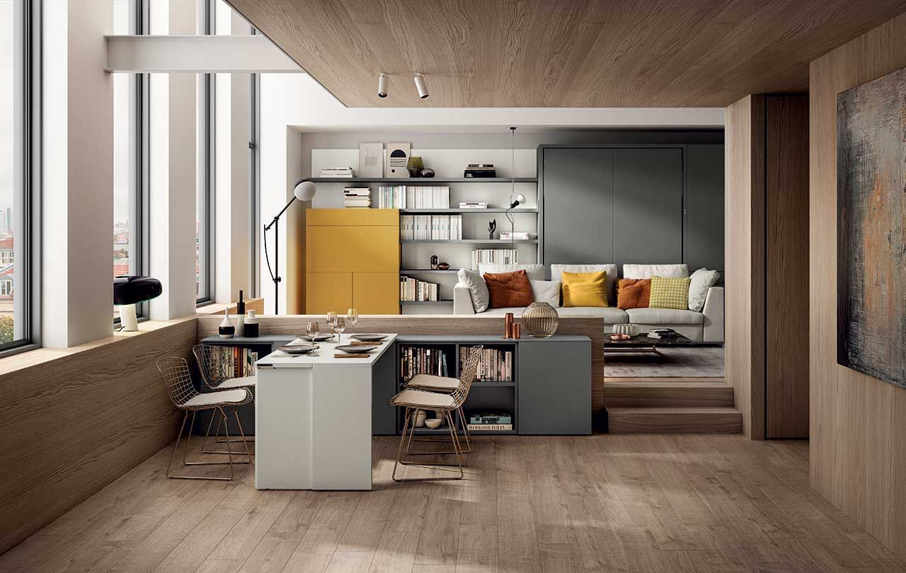
While Resource was a veteran leader in high-end European furniture, it was time to spotlight its natural place as a front-runner in urban living solutions: sustainability focused, technologically advanced, and championing elegance and innovation in every piece of their collection.
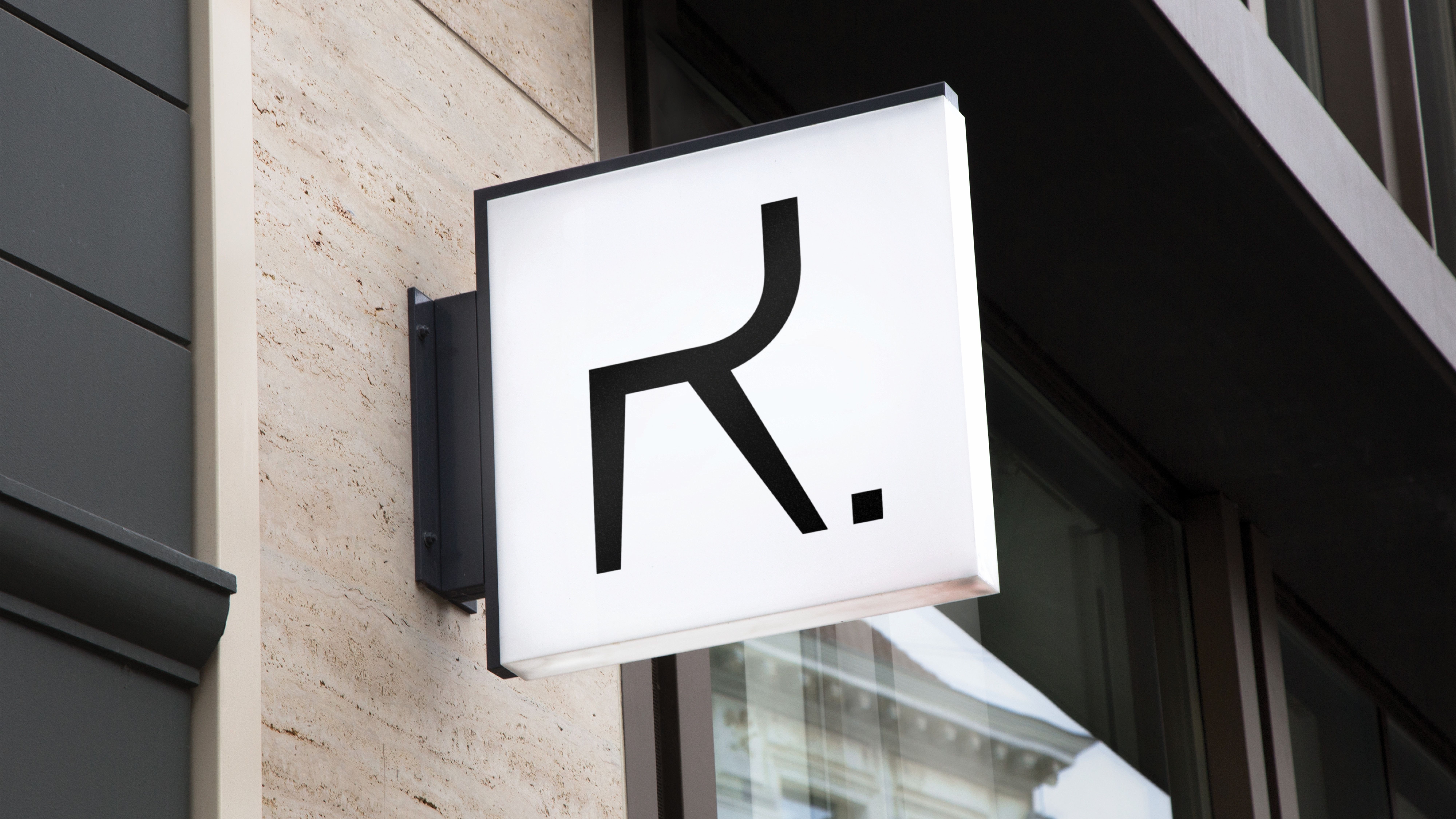
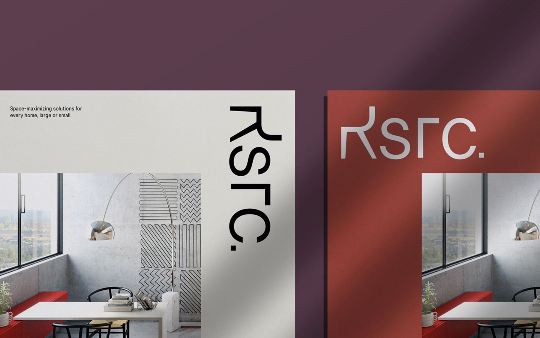
Introducing the R-chair
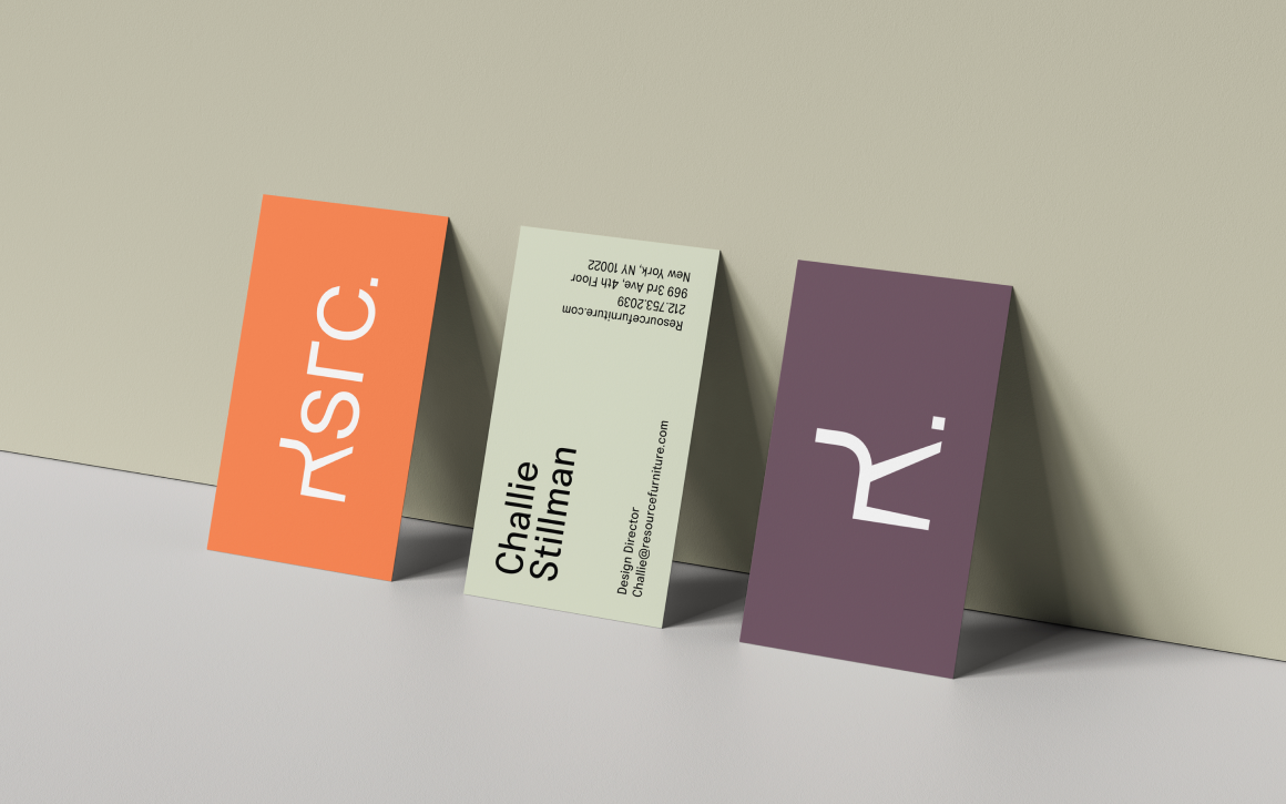
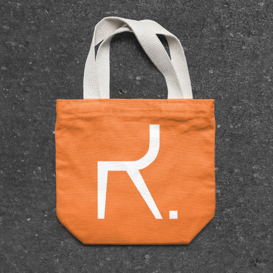
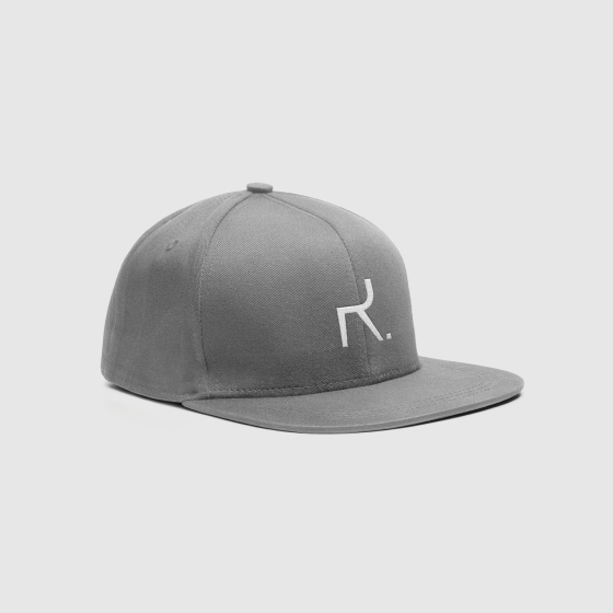
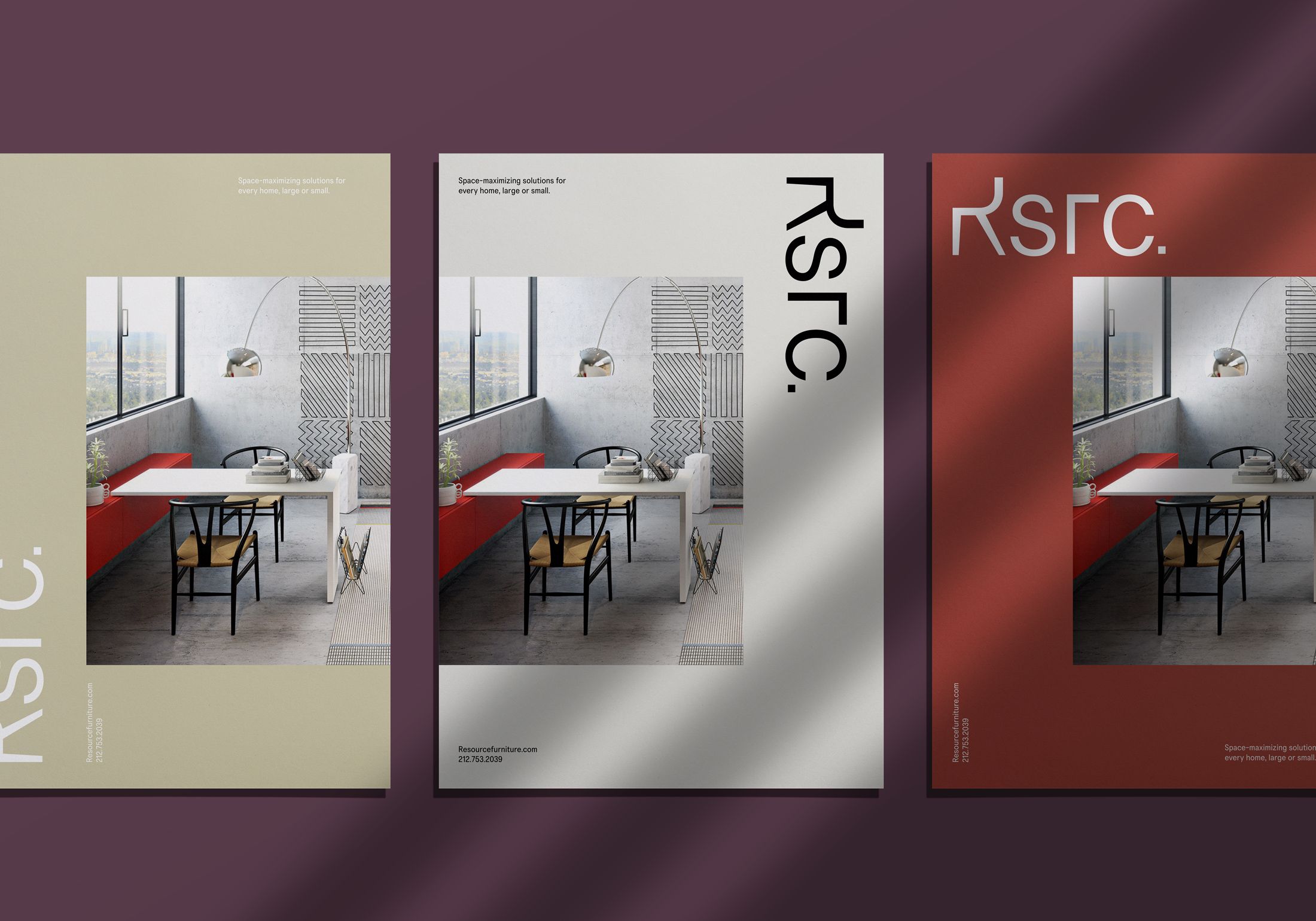
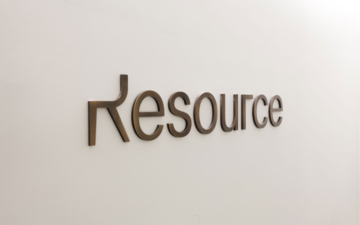
The resulting brand design sought to stay true to the nature of Resource’s transforming collection, with the identity including three marks suited for different spaces.
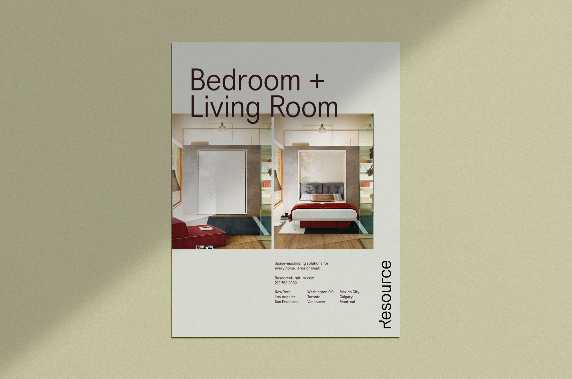
Inviting users to imagine a limitless lifestyle
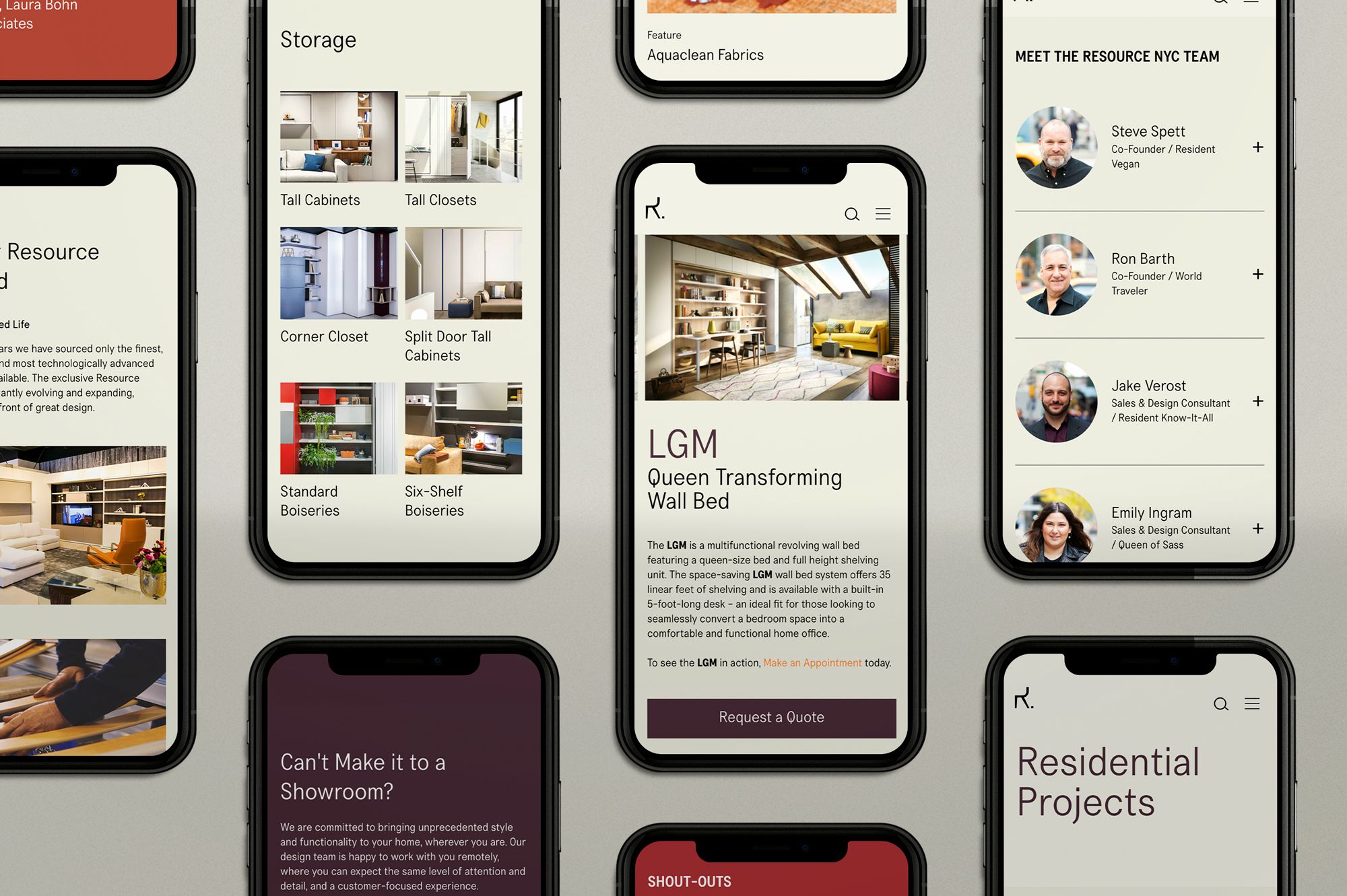
Brand touchpoints incorporate a delightfully unexpected use of space, matched with a vibrant yet sophisticated tone. With the client experience occurring both online and in-person in Resource showrooms, the brand system was extended to both print and digital materials, including tear sheets, magazine advertisements, social media assets, apparel, and presentation templates.
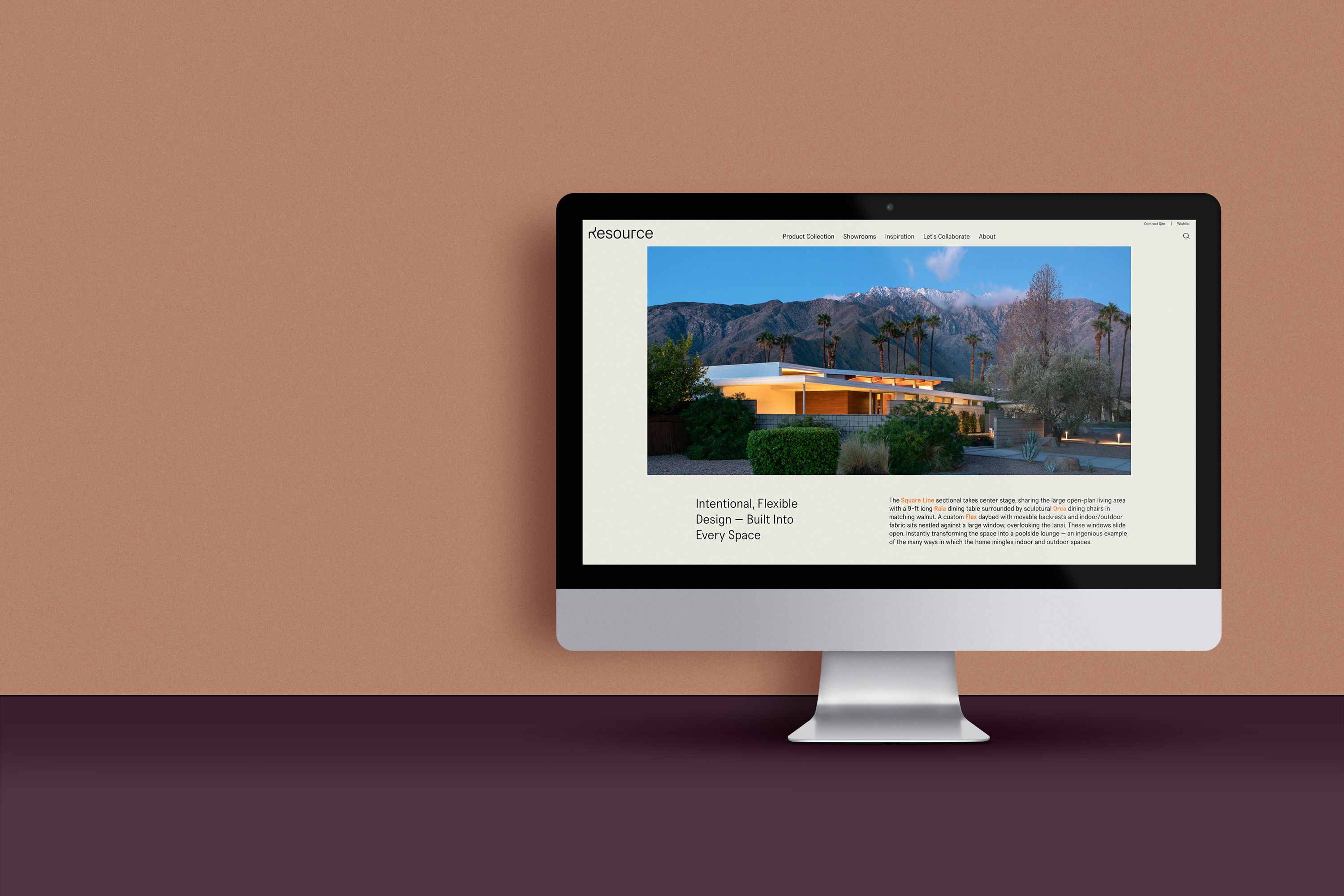
Designed for delightful discovery and effortless education
At Resource, customers encounter a unique and high-touch sales experience, so it was important to optimize the website user experience to provide upfront education about the process. During the UX phase, we also re-envisioned how users discovered Resource’s product offerings and their transforming capabilities, and turned a strategic eye to the placement of key calls to action.

The new logo now reflects a design-driven, high-quality business through a simple and confident wordmark with not one but two clever twists.
Armin Vit / Editor at Brand New
Let’s work together.
