Statehouse Columbus
Columbus, Ohio’s student housing market is a bit different from the rest. With a strong collegiate history and pride, the community prefers to hold on to age-old institutions, both on and off campus. With most students either living in OSU dorms or (often rundown) single-family rentals, purpose-built student housing is not the norm but the exception in the Columbus rental market.
L3 Campus saw a unique opportunity to unite a promising portfolio of five properties with a more vibrant, sophisticated brand identity — making them a stand-out option for students looking for the big win in their choice of housing.
Brand Strategy
Naming System
Brand Identity
Animation
Signage
Marketing Materials

Big Ten energy
Ohio State is a “Big Ten” university in Division 1 athletics — sports, school pride, and a winning mentality are hallmarks of this student community. We knew immediately to lean into this energy and spirit in the brand strategy.
Fortunately, these properties were already strong players in the market with key unique value propositions across luxury amenities, expert professional management, and high-end safety and security measures. It was a perfect match to position the brand as an MVP housing option for students who chase championships.
Embracing collegiate cool
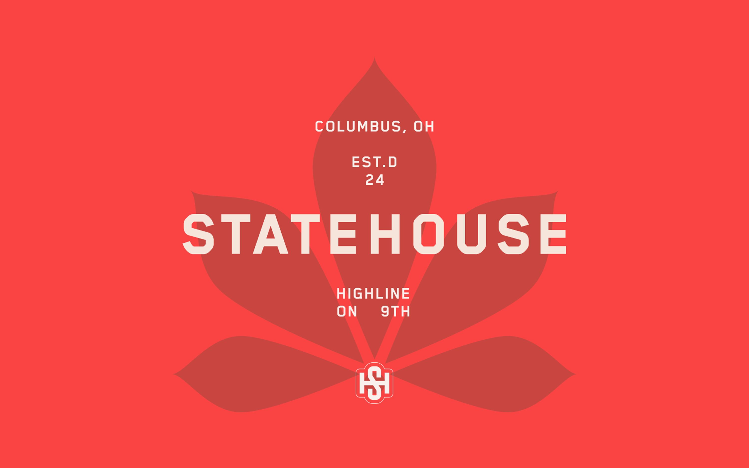
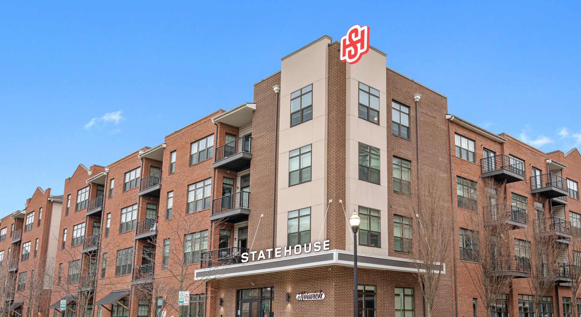
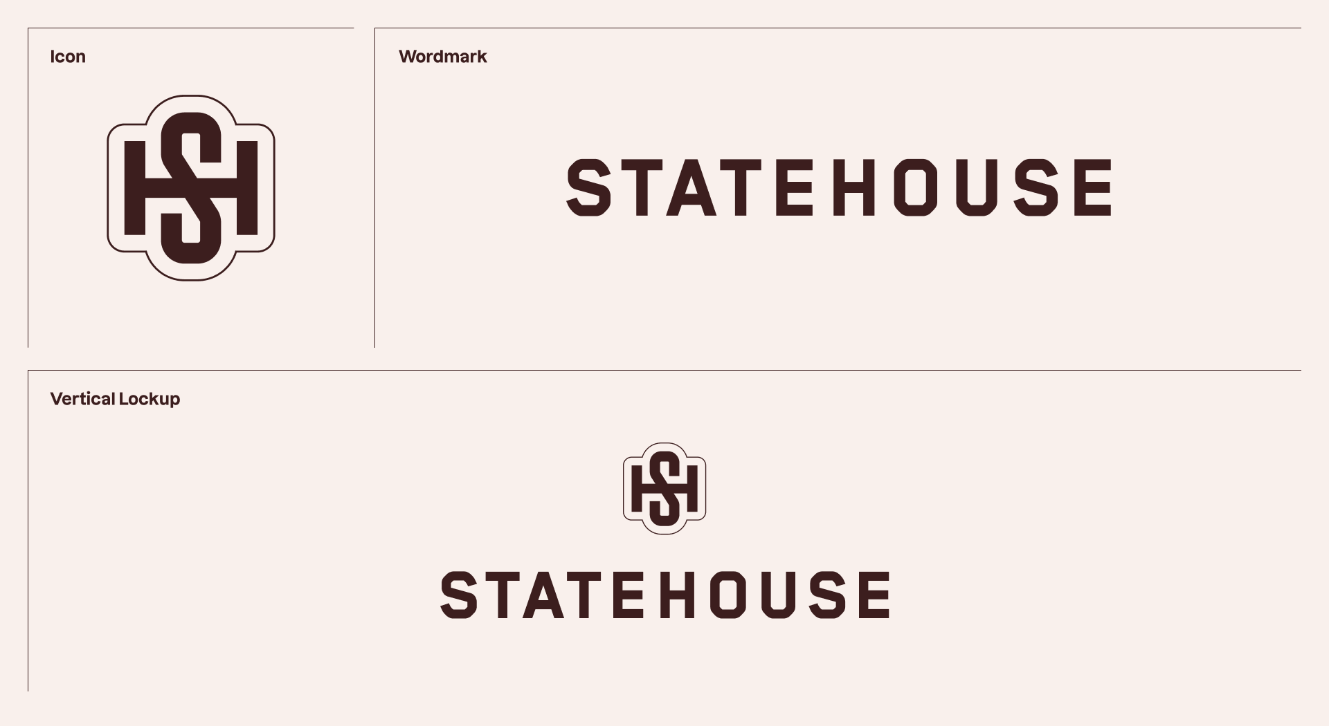
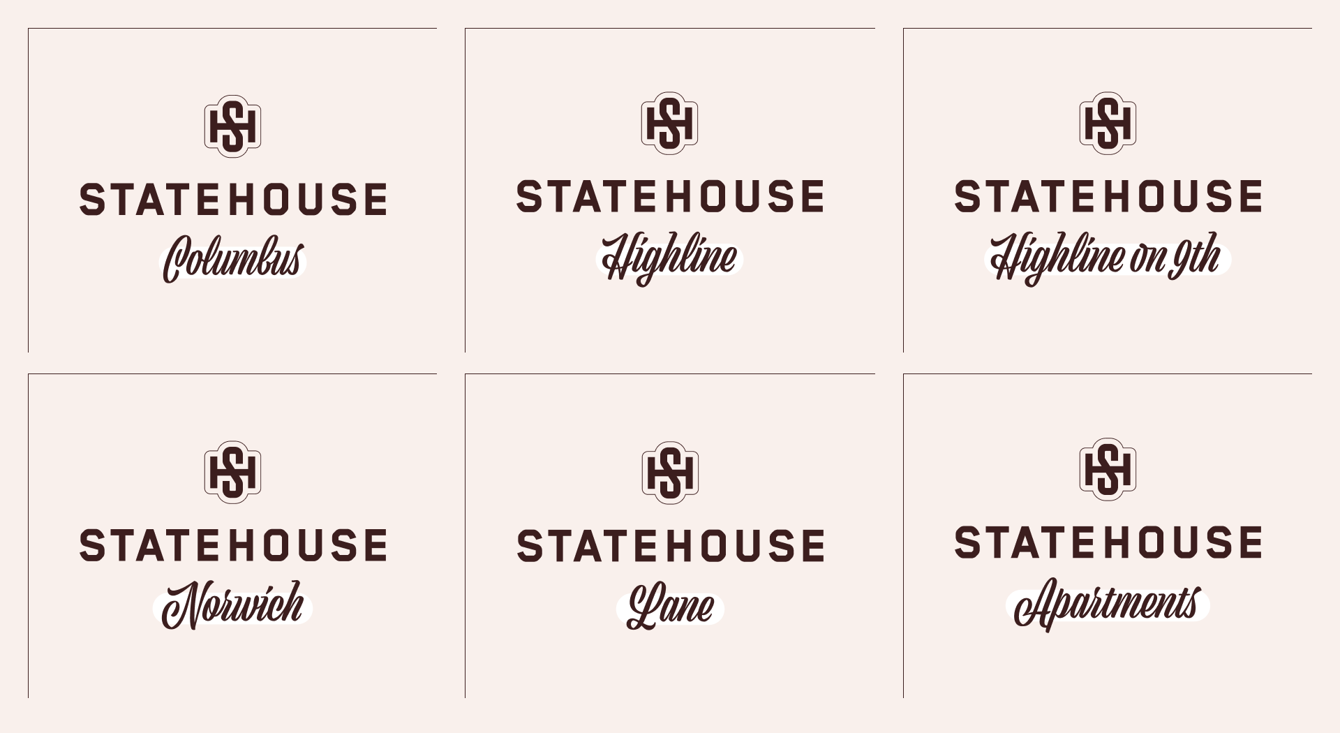
The brand design looked to tie in a sense of OSU school spirit, without being too obvious or played out. The leading mark is a monogram inspired by letterman jackets, paired with a wordmark with a similar athletic vibe. We brought in Viktor Script to distinguish property names in lockups — a typeface that nods to old-school collegiate without going too retro.
For the color palette, we had to be careful not to use colors associated with not only other student property brands, but also OSU’s rivals in the Big Ten Conference. We landed on a more modern take on Ohio State red as the leading brand color — something that students already like and want to rep both on and off campus.


An all-star lineup
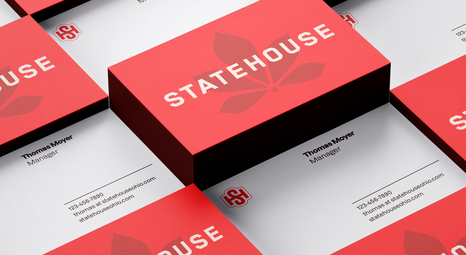
Secondary brand graphics bring in familiar images like the OSU buckeye leaf, football, and basketball, as well as an abstract set of visuals for adaptable messaging. Layering graphics and typography together once again brought in a collegiate feel.
Animation gave these graphics and brand marks added personality and movement — an inspiring energy for an active and athletics-focused student community.

Equipped for success
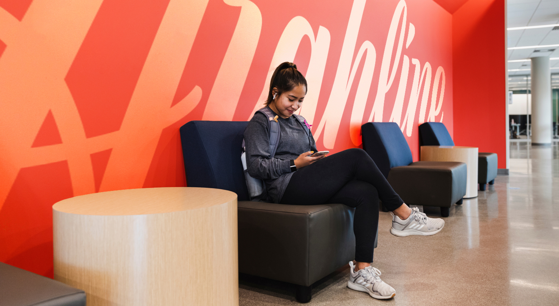
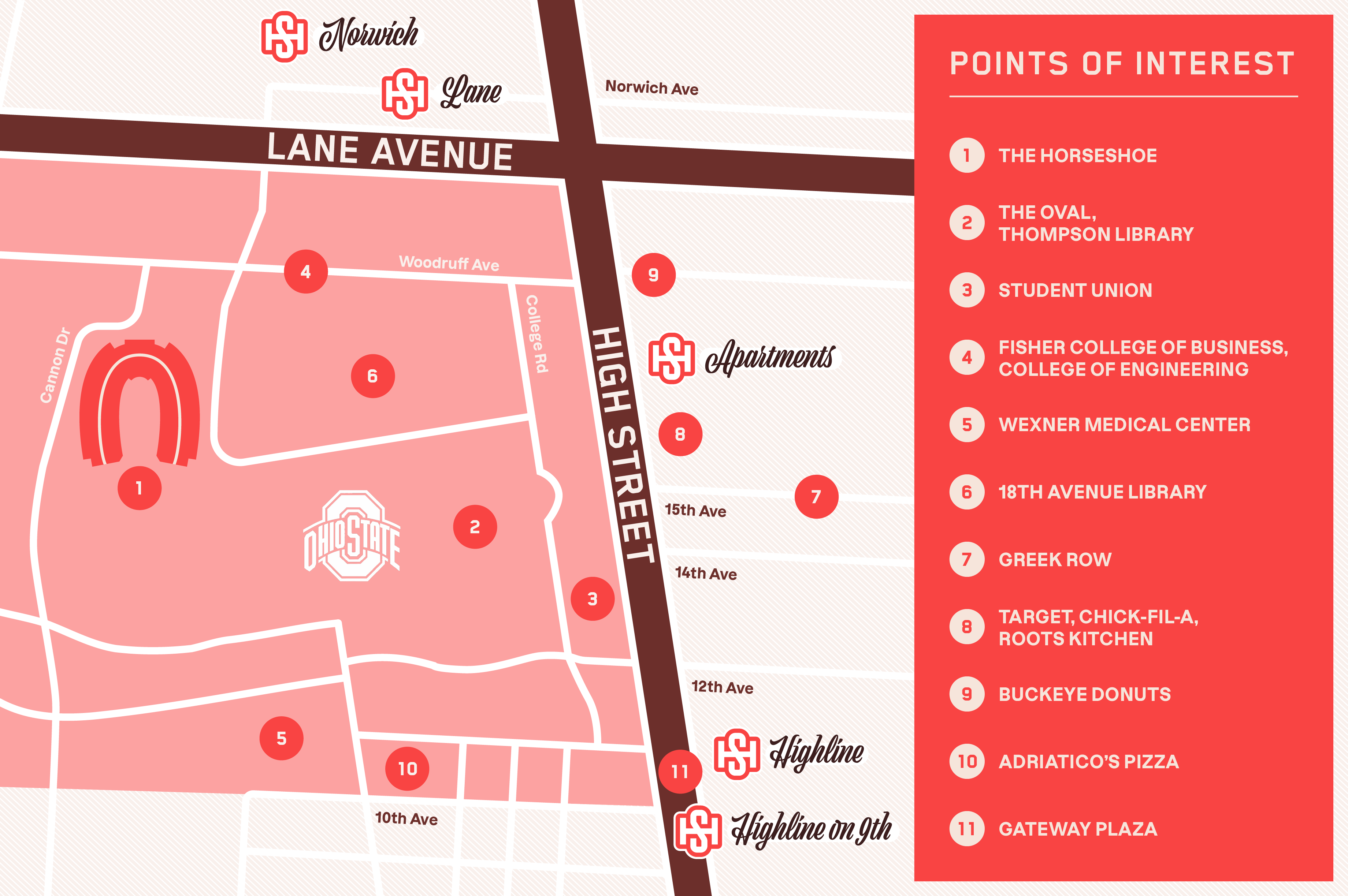
L3 Campus looked to launch the new property names and brand ASAP once the acquisition was finalized, to make an immediate impression right before school let out for the summer. Signage included exterior, way-finding, and interior art for a few quick-win updates just in time to wrap up leasing for the fall. Marketing materials including a custom map, print materials, banners, and merch all work to complete the full-scale brand overhaul.




For the win
The all-new StateHouse Columbus brand launched in April 2024. With the brand’s vibrant, elevated feel that taps into school pride that runs deep, students are invited into a community that has their back and cheers them on. Whether residents prefer to be at the center of activity on High Street or more integrated with North Campus culture, there’s a StateHouse for everyone.

Let’s work together.

